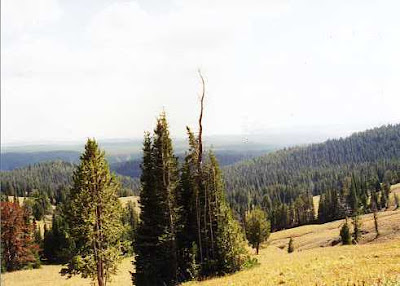
Here is an example of an experiment: working from a photo. I can count on one hand the number of times I have tried painting or drawing from a photo. Let's face it--the camera distorts what is "out there." One does not get the feel of the panorama in a photo. I my mind the artist is better able to depict the three dimensionality of the place and put it into a two dimensional format better than the camera. And I have friends who can spot a painting done from a photo in an instant. I would rather work from life. But one day I decided to spend the day on composition issues and did about 50 thumbnail sketches from photos. I was more interested in the composition than anything else that day so I thought photos I'd taken would work.
Below are two photos taken in Yellowstone Park followed by six of the thumbnails and then two stages each of two paintings.

1
What interested me was the bright grassy meadow against the dark trees.
 2
2This second photo shows continuation of the panorama--just some visual information but nothing that "grabbed" me.
Thumbnails
The question was where to crop the image. I ended up trying two options. First the upper left thumbnail, below, and then the thumbnail on the right.
 More thumbnails
Using the first thumbnail I did a color study to see if I could work out capturing the feel of the day. Unfortunately I had not make a sketch of the scene and relied on the camera. For me a sketch has a lot more information than a photo. I have been able to develop paintings from sketches even without color notes. In a sketch your eye and hand do the editing and you get to the essence of what attracted you to the scene in the first place. And conveying that idea is what I want my painting to be about.
Below is stage 1 done on ColorFix sanded paper.
 Stage 1
In stage 2, below, additional layers of pastel help push back the hills in the distance and give a little more shape to the grassy meadow.
 Stage 2
The format was not working for me so I started a quick study on mat board coated with a few layers of transparent gesso. I like the texture of the brush marks and the gessoed surface allows me to wet the surface down after I lay in my first layer of pastel. You can see a bit of the underpainting where I have put down warm colors where the sun hits and cooler colors in the shady areas.
Stage 1 below.
 Stage 1
Stage 2 of this study starts to tone down the intense yellows, give a bit of form to the trees and begin to soften up the distant hills.
 Stage 2
The next several stages are yet to come. Time to put these studies away and return to them with fresh eyes.
 Light on Branches Covered With Lichen 10x7.5"


