 "Hungry Horse Evening," pastel, 6 1/2 " x 17 1/2."
A few weeks ago I was asked to give a talk on the subject of drawing and painting the landscape. The audience was a group of journalers who meet regularly at The Minnesota Center for Book Arts. The talk was to encourage the members who did not often (or ever) use the landscape as subject matter in their journals to give landscapes a try.The subject of landscape painting is, appropriately, huge. But I needed to boil it down to something manageable in the time I had. After much thought about how it is that I do what I do when out plein air painting I came to the conclusion that my talk to could be summarized in one word: "Simplify."
For me it is a matter of getting down the basic masses and their values. Seems fairly simple to me now, but it wasn't always so. I think it has just taken years of looking and analyzing. And lots and lots of drawing. That said, I had to give them some other practical hints to take home.
I started to reflect on how it is that our preconceived notions sometimes get in the way of seeing. And I remembered the old problem most people have when they draw a face: the eyes are usually drawn way too high on the head resulting in a tiny forehead and a funny looking drawing that does not look like a person. We learn eventually to trust the classic diagram of a head based on actual measurements that shows the correct placement of the eyes to be smack dab in the middle of the face. The other parts of the face like the nose and mouth, distance between the eyes, placement of the ears, et cetera, really are where they are because we can measure them. Once we have measured the distance between features that usually calms down the part of our brain that is yelling at us to say "The eyes are too important. They must be higher on the face than half-way between the chin and the top of the head!"
So, I wondered, if there was an analogy that would help describe something about the landscape. Probably not since there are always some exceptions to the "rule." However there is a sort of rule-of-thumb useful for general lighting conditions from the famous artist/teacher John F. Carlson, author of
Carlson's Guide to Landscape Painting. First published in 1929 it is now available from Dover Publications,
http://www.doverpublications.com/. In it he describes his Theory of Angles.
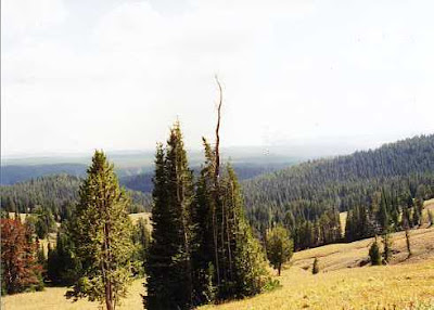
Carlson believes that "the prime cause of the big light-and-dark relations in a landscape is the angle which such masses present to the source of light (the sky)." In a nutshell Carlson points out that there are four basic planes in a landscape: the ground or flat-lying plane, the vertical plane of the trees, the slanting plane of the hills or mountains and the arch of the sky which is the source of light. "Our landscapes' prime elements--tree, ground, mountains, etc--receive light from the sky differing degrees of light depending on their plane...." p. 33. The result is that the sky is the lightest element, the ground the second lightest, the upright trees the darkest and the mountains/hills the lighter than the trees and darker than the ground plane. (With some exceptions, for example, when the ground is covered by snow it will be lighter than the sky except for the part of the sky near the sun.)
The audience seemed to understand that. And then one of the audience asked me a question about light on the water.
Hmmm. A good part of my life has been spent staring at water or thinking about how light hits the water. In particular the great expanse of Lake Superior. I have, for hours, stared at, drawn, painted and studied the way light changes the look of the water. When she asked me how The Theory of Angles applied to water I could only think of the number of times I had seen it darker than the sky and then of the times it was lighter than the sky--or both at the same time.
(Below is a gouache painting I did one summer while looking out over Lake Superior. Here the water is darker than the sky, but the same scene on a cloudless day might look any number of different ways. In some cases the water would be the same value as the sky to the point that it is impossible to see the horizon. The painting,
Hungry Horse Evening, at the beginning of today's entry, illustrates the "rule" that the ground plane--in this case the water--is darker in value than the sky.)
 Untitled, gouache, 4" x 6."
As I drove home I realized having a set rule for how light behaves on water was one of those times as Carlson says, "If the student will once recognize the general and everyday value-differences in anything, he can easily see for himself any incidental departure from this common condition. He will in time despise any 'rule' concerning painting." p. 42.
So, in the case of water, look. Then trust your eyes.


